mel’s Calligraphy
what calligraphy means to me
I love embracing my Taiwanese heritage because it adds a colorful layer to my character and perspective. One way I remind myself is by practicing traditional calligraphy. Growing up, I was lucky enough to have an encouraging mom who pushed me to learn about the beautiful arts that came with being Taiwanese. Through a shared appreciation of calligraphy and culture, I was able to meet many people who pushed me to uncover who I am.
In 2014, I began the study of traditional Chinese calligraphy with my teacher and mentor, Chen-Lieh Huang. From a technical aspect, this art taught me how to appreciate balance. Within the structure of each individual character, the brushstrokes of dark in compliment each other to build up a delicate structure that is balanced yet dynamic. The dark ink can also range in shade, depending on the pressure applied by the brush. Therefore, each brushstroke of dark ink, or 墨 (mo4), on white rice paper, 宣紙 (xuan1 zhi3), creates a dance between positive and negative space. Not only does balance need to flow through each individual character, but the entire piece must be in harmony because one character never stands alone. Every component, from the strokes of the characters to the placement of the stamps and signatures, works together to bring forth an ebb and flow that pulls the viewers attention from the beginning of the piece to the end.
Calligraphy also refined and sharpened my design mindset, as I learned to be discipline and managed my focus and concentration. Choosing what to concentrate on allowed me to become more patient and thoughtful with my decisions; any small movement can have a lasting impact, as ink is an unforgiving medium.
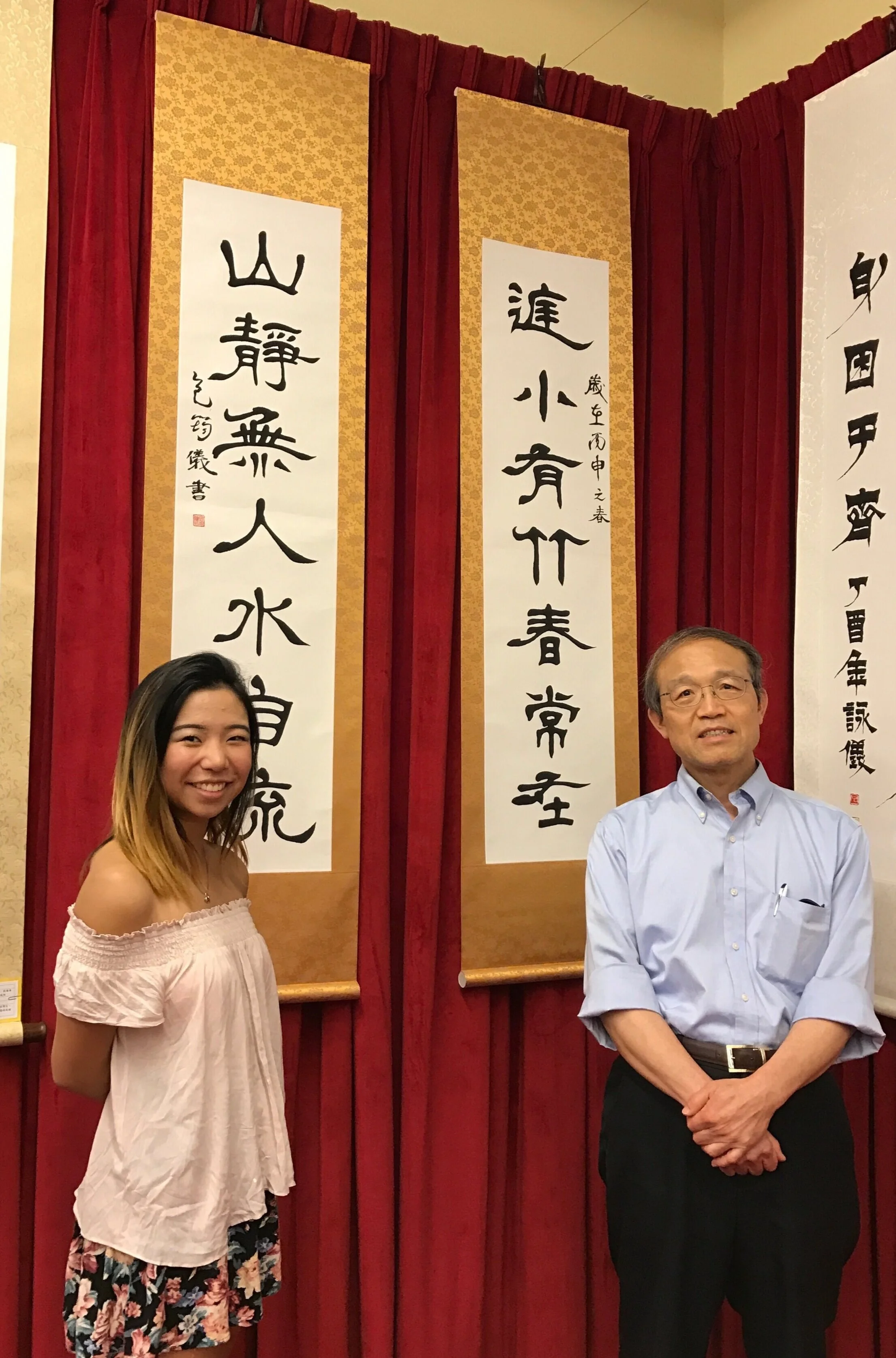
I competed in the Annual All-American Chinese Brush Painting and Calligraphy Competition sponsored and organized by the Foundation for Chinese Performing Arts, placing 2nd place in 2016 and receiving Honorable Mention in 2015. I specialized in practicing the script of the Qin dynasty, called 隸書 (li4 shu1). Below is my 2015 competition piece:
2015 Honorable Mention.
Below are my pieces from the 2016 competition. I took on the challenge of writing on a larger scale which is often more difficult to accomplish based on principles of balance, speed and weight. The structure of the strokes and characters are emphasized, as the brush must travel across greater areas of paper. It was a wonderful challenge!
2016 2nd Place.
Local calligraphy exhibition in Bay Area, 2016.
My mentor often prompted me with ways to view and think of language differently. Below is an example of calligraphy that showcases a fusion of Chinese and English, designed by my mentor. While he admired the structure of Chinese characters, he wanted to bridge the gap between written languages. In the example below, each letter of the English word is rearranged in a way that mimics the structure of a Chinese character. Can you tell what it says?
The Night with Love (top right to bottom left).


